
What’s the question?
Dividend yield is the last twelve months of dividends over the share price, and income screens rank on it everywhere. The ratio rises for two opposite reasons, though: when a company raises its payment, and when the price falls, and a falling price is often the market’s verdict that the payment will not survive. A yield trap is a stock whose headline income is what it is about to stop paying.
So does a company’s rank on yield predict whether its dividend gets cut? And does the payout ratio sharpen that warning or merely repeat it?
The approach
The universe is the S&P 500 as it stood each December from 2013 to 2023, not as it stands today, so companies that later left the index stay in. Built from SEC EDGAR public filings and market data, addressed by permanent entity id.
- Rebuild each year’s dividends from the cash paid on each ex-date, restated onto one share basis so a split cannot read as a cut.
- Reduce the year to a regular payment rate: the average payment after discarding anything above one and a half times that year’s median, which removes one-off specials.
- Set the yield at the end of year Y to that rate times the usual payments a year, over the year-end price, then sort into quintiles within the year.
- Record a cut when the regular rate in Y+1 or Y+2 falls more than 10 percent below year Y’s.
- Take the payout ratio for year Y from the filings, common dividends paid over net income. Where net income is zero or negative no ratio exists, so those company-years form a fourth group.
- Require a dividend in Y-1, a price series still trading two years later, and no monthly move outside -70 to +150 percent, which marks a corporate action the arithmetic cannot absorb.
That leaves 4,190 company-years across 524 companies.
Code
import numpy as np
import pandas as pd
import xfinlink as xfl

xfl.set_api_key("YOUR_API_KEY")  # free at https://xfinlink.com/signup

YEARS = list(range(2013, 2024))
rosters = {y: xfl.index("sp500", as_of=f"{y}-12-31") for y in YEARS}
ids = sorted({int(i) for r in rosters.values() for i in r["entity_id"].dropna()})

px = pd.concat([xfl.prices(entity_id=ids[i:i + 40], start="2011-01-01", end="2026-08-01",
                           interval="1mo", fields=["close", "adj_close", "dividend"],
                           max_rows=200000)
                for i in range(0, len(ids), 40)], ignore_index=True)
px["date"] = pd.to_datetime(px["date"])
px["year"] = px["date"].dt.year
# close is as-traded, adj_close is split-adjusted, so the ratio restates every
# cash payment onto a single share basis
px["div_adj"] = px["dividend"].fillna(0.0) * px["adj_close"] / px["close"]

def regular(payments):               # discard one-off specials
    v = payments.values
    return v[v <= 1.5 * np.median(v)].mean()

paid = px[px["div_adj"] > 0]
rate = paid.groupby(["entity_id", "year"])["div_adj"].agg(rate=regular, k="size").reset_index()
freq = rate.groupby("entity_id")["k"].agg(lambda s: s.mode().iat[0])

year = px.groupby(["entity_id", "year"]).agg(price=("adj_close", "last")).reset_index()
year = year.merge(rate, on=["entity_id", "year"], how="left").fillna({"rate": 0.0})
R = year.pivot(index="year", columns="entity_id", values="rate")
P = year.pivot(index="year", columns="entity_id", values="price")

rows = []
for y in YEARS:
    members = set(rosters[y]["entity_id"].dropna().astype(int))
    fr = pd.DataFrame({"rate": R.loc[y], "next1": R.loc[y + 1],
                       "next2": R.loc[y + 2], "price": P.loc[y]})
    fr = fr[fr.index.isin(members) & (fr["rate"] > 0)]
    fr["yield"] = fr["rate"] * freq.reindex(fr.index) / fr["price"]
    fr["cut"] = (fr[["next1", "next2"]].min(axis=1) < 0.90 * fr["rate"]).astype(int)
    rows.append(fr.assign(year=y).reset_index())

d = pd.concat(rows, ignore_index=True)
d["q"] = d.groupby("year")["yield"].transform(lambda s: pd.qcut(s, 5, labels=False) + 1)
print(d.groupby("q")["cut"].mean())
Full script with formatting and visualisation: high-dividend-yield-cut-risk-python.py
Output
formation years 2013-2023    company-years 4190    companies 524
dividend cut within two years, whole sample: 6.9%

Quintile  median yield  cut within 2y  median 2y dividend growth  median payout
   Q1         0.74%          3.1%               +24.0%                   20.0%
   Q2         1.46%          4.3%               +21.2%                   32.3%
   Q3         2.11%          4.3%               +17.6%                   41.2%
   Q4         2.87%          6.0%               +12.2%                   55.3%
   Q5         4.17%         17.0%                +5.4%                   74.2%

Q5 minus Q1: +13.9 points   z = 9.51, p = 2.0e-21
Q5 cut rate exceeds Q1 in 11 of 11 formation years
Top quintile: 12.3% cut where a payout ratio exists (715), 44.0% where it does not (125)

Cut rate by yield quintile and payout ratio (company-years in brackets)
"no ratio" = net income zero or negative, or no annual period matched to that year
              under 60%       60 to 100%        over 100%         no ratio
      Q1           2.3% (739)       0.0% ( 20)       4.3% ( 23)      13.3% ( 60)
      Q2           3.8% (710)       3.9% ( 51)       0.0% ( 25)      14.0% ( 50)
      Q3           2.9% (624)       1.8% (114)      10.2% ( 49)      22.4% ( 49)
      Q4           5.5% (453)       3.2% (217)       3.6% (111)      25.5% ( 55)
      Q5          11.5% (260)       8.8% (227)      16.7% (228)      44.0% (125)
        all       4.2% (2786)       4.9% (629)      11.0% (436)      28.0% (339)
What this tells us
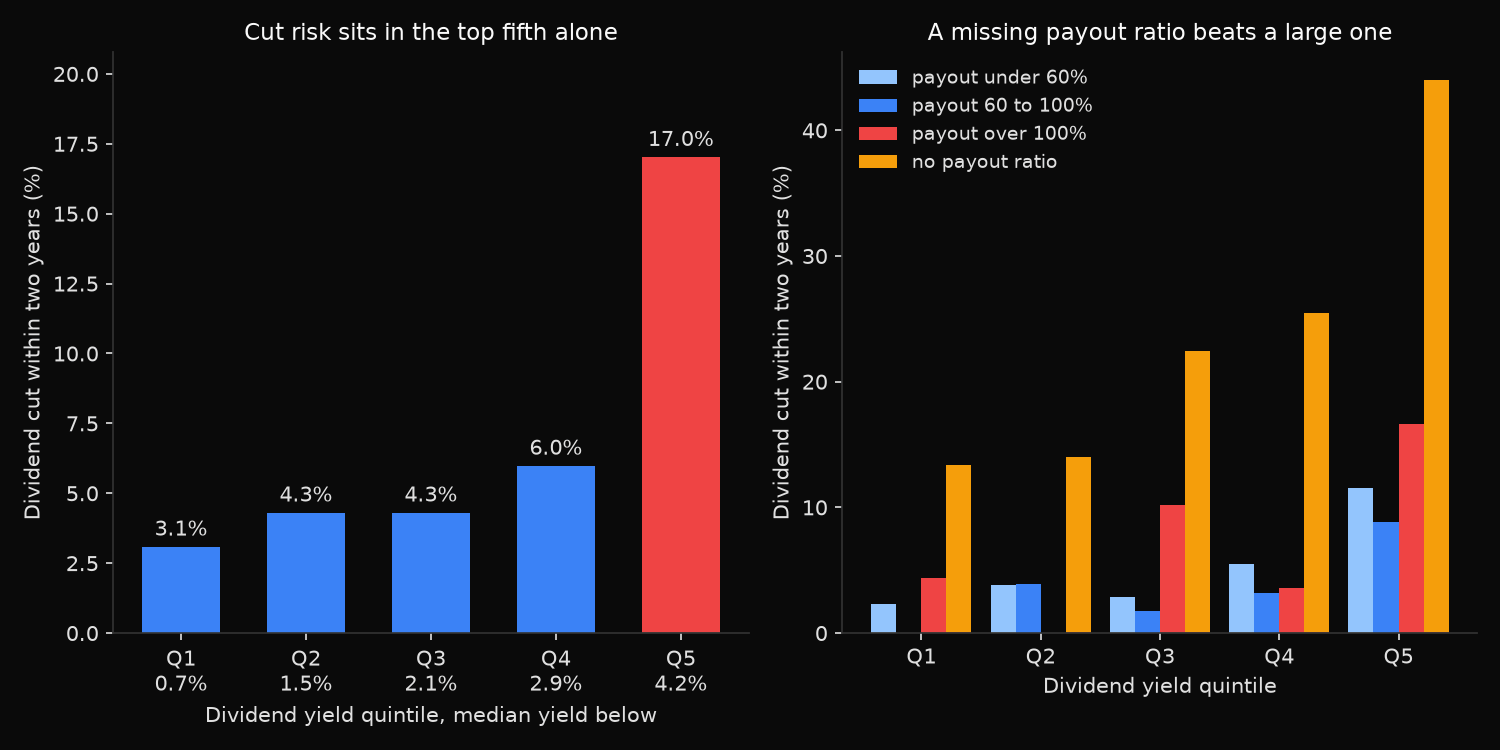
The signal is real, and it is not a gradient. The first four quintiles sit inside a narrow band, 3.1 to 6.0 percent, and the fifth jumps to 17.0 percent, five times the safest group. The gap is 13.9 points with a z-statistic of 9.51, and the top quintile cut more often than the bottom in all eleven formation years, which is not the residue of a single recession. It is also not a verdict: that same 17.0 percent says 83 of every 100 high-yield company-years passed through two years with the regular dividend intact or larger.
The dividend growth column behaves quite differently, declining at every step from 24.0 percent over two years in the lowest quintile to 5.4 percent in the highest, with no flat middle. Cut risk is concentrated at one end; the growth cost of buying yield is paid across the whole distribution.
The payout ratio adds less than its reputation suggests. Its three buckets inside the top quintile span 8.8 to 16.7 percent, so even the uncovered group barely moves off the 17.0 percent quintile average, and the gap between the two covered groups is inside the noise on samples near 250. Across the lower four quintiles it orders nothing. The fourth bucket is where the quintile average actually comes from: no ratio exists when net income is zero or negative, and the 125 top-quintile company-years in that state were cut 44.0 percent of the time against 12.3 percent for the 715 with a ratio to compute. Whether a company earned anything matters far more than how much of it was paid out. Free cash flow coverage, weighed against the payout ratio as a warning of cuts, is the subject of a point-in-time dividend-cut screen.
So what?
Use a two-stage screen, and make the second stage profitability rather than the payout ratio. Rank on yield and investigate only the top fifth, because the difference between a 1.5 and a 2.9 percent yielder carries almost nothing. Then split that fifth on whether the formation year produced a profit: 44.0 percent against 12.3 percent, far wider than the payout ratio delivers, where even a payout above 100 percent reaches only 16.7 percent.
Then size against the base rate: a basket of twenty top-quintile names should expect roughly three cuts inside two years. Diversified that is survivable; concentrated in four or five names it is not.
Two of those choices are not housekeeping. Companies that cut are disproportionately the ones that later leave the index, and a special dividend inflates the trailing yield then guarantees a decline the next year. Skip either and the test manufactures its own result.
Dividend growth is the more actionable column: it falls smoothly as yield rises, long before cut risk appears, so harvesting income in the fourth quintile rather than the fifth keeps most of the yield at a fraction of the risk.
Built with xfinlink — free financial data API for Python.